Data visualization … infographic … visual storytelling. We see these terms frequently these days and are often told that these images, in fact, comprise storytelling.
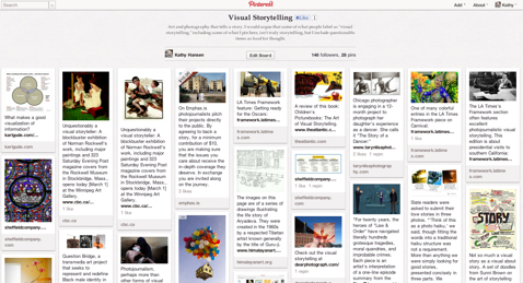
I’ve wrestled with the concept of visual storytelling. I have periodically presented in this space roundups of artifacts touted to be “visual storytelling,” and now I do the same with a Pinterest curation.

I have slowly come around to the belief, however, that probably none of these artifacts can truly be characterized as storytelling.
Zach Gemignani recently reinforced that view in a post entitled Data Visualization as Storytelling: A Stretched Analogy:
For practitioners of the craft, connecting our work to stories feels satisfying — it is a call to raise our standards and an opportunity to enhance the influence of our field. Stories evoke images of rapt audiences, dramatic arcs, and unexpected plot twists.
Unfortunately this analogy is a stretch. The truth is that many of the core elements of stories simply aren’t evident in data visualizations: characters, a plot, a three-act structure, a beginning and an end. Occasionally, the narrative flow of a story can be glimpsed in an infographic or dashboard.
At the same time, data visualizations have fundamental characteristics missing from traditional storytelling. Interactive data visualizations let the audience explore the information to find the insights that resonate with them. Visualizations should take shape based to a large extend on the underlying data. And as this data changes, the emphasis and message of the visualization is likely to change.
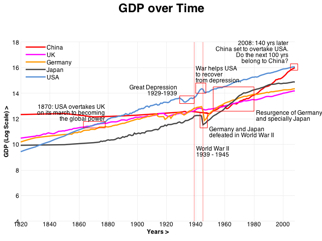
Gemignani’s view especially resonated with me after I saw a post entitled A Storytelling Experiment by Robert Kosara. Kosara asks visitors to click to “be taken to one of several slightly different versions of a visual story about the development of the gross domestic product (GDP) in different countries.” The user does indeed get a different version of the visualization each time he or she clicks. The experiment is that the version that represents the best storytelling will be most often shared by users:
You will help us understand which types of storytelling work and which don’t. … This is as much an experiment in running experiments as it is an experiment on storytelling: we’re measuring the effectiveness of the different versions by tracking how often they are shared.

Well, the visualizations (see one version at left) are very clever and interesting, but they are not storytelling.
I maintain that many artifacts characterized as data visualizations, infographics, visual storytelling, and other labels still have value in the story world because they suggest or enhance stories.
If I analyze the types of item in my Pinterest curation, I come up with:
- Art that inspires the viewer to construct a story while viewing it. (The artist undoubtedly had a story in mind when creating it that may or may not be the same as the tale the beholder weaves.)
- Illustration meant to enhance or reinterpret a story told in another form.
- Photojournalism that goes a long way toward telling a story of an event on its own but usually needs the context of words to convey a holistic story.
- Photo essays by photographers who specialize in shooting families, children, and family events. These pieces generally suggest an aura of story by providing a visually pleasing slice of the subjects’ lives. Since they are often posed shots rather than candids, the story portrayed may not be fully authentic.
- Similarly, photo essays, often about celebrities, that don’t reveal much if a story, but do offer small, candid slices of life.
- Tools that employ visuals in some aspect of a storytelling process.
- Visualizations of meetings and events that employ an emergingly popular visual note-taking process. These pieces document the events, but do they really tell their stories?
I will continue to explore the storied aspects of visual forms even while rejecting the “storytelling” label thrust upon so many of them.
